How To Use Graphic Design To...
Author: Michael Bierut
Publisher: Harper Design
Year Published: 2015
Dimensions: 10in. x 10in.
Pages: 320
TITLE AVAILABLE AT
Barnes & Nobles
Counterprint
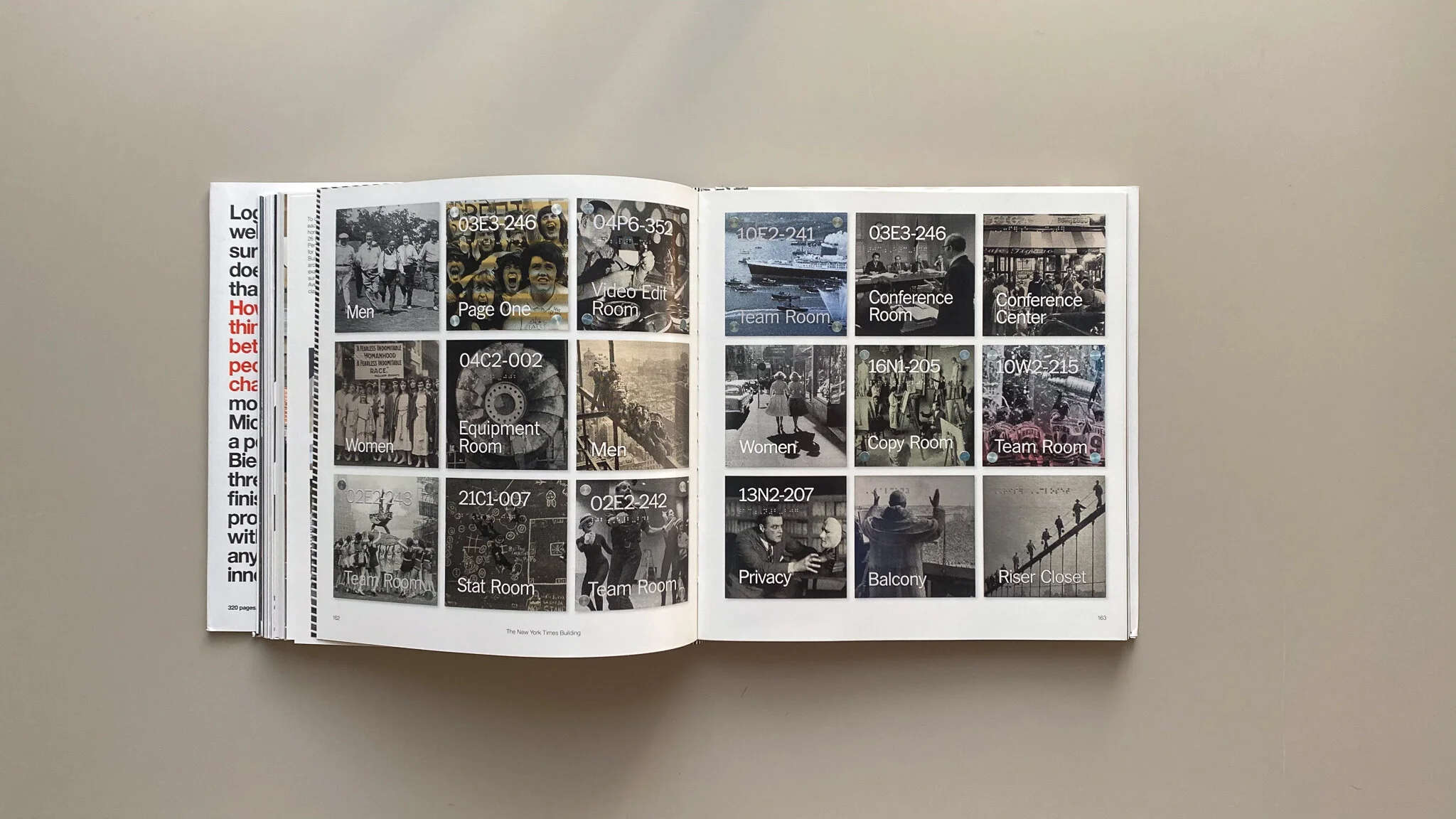
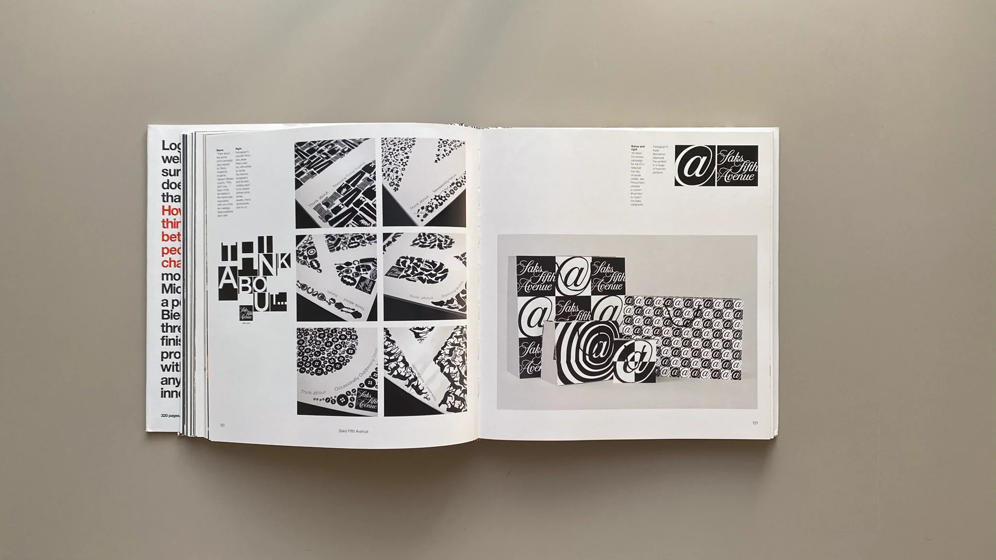
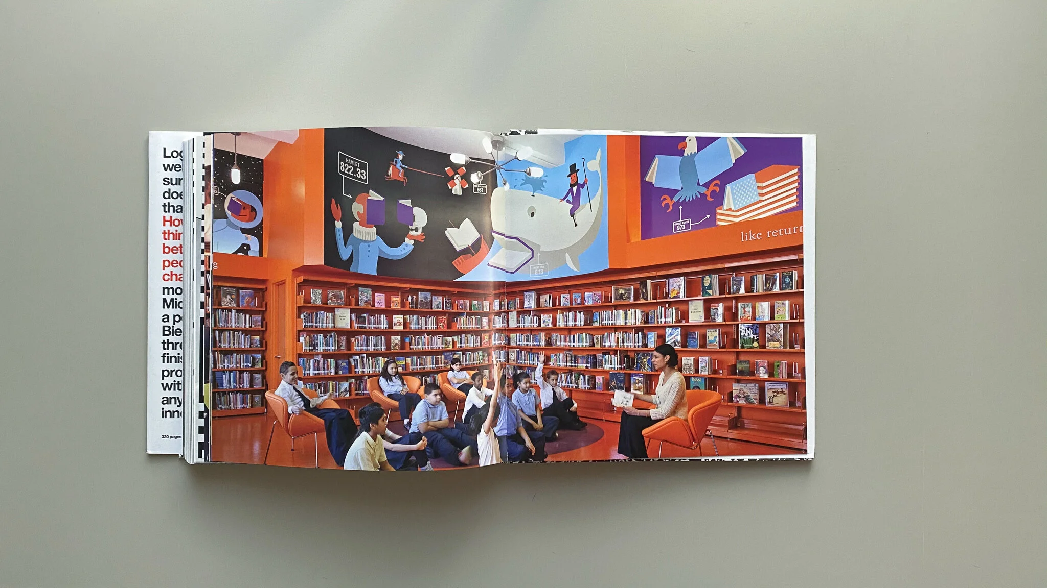
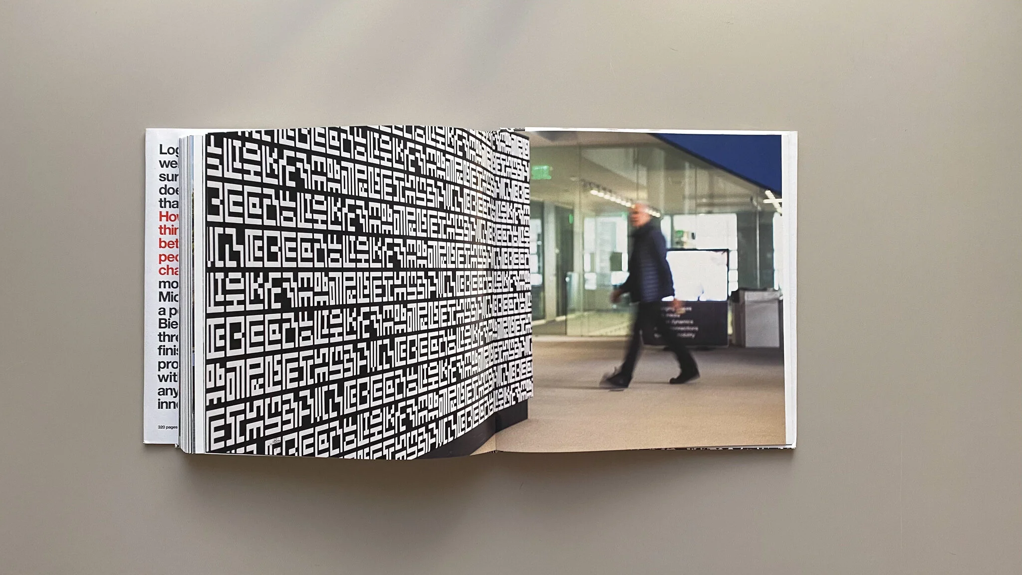
How To is Michael Bierut's monograph of his work at Vignelli Associates and Pentagram as well as his manifesto. This book features over 35 of his projects ranging in brand identities, poster designs, and experience design, and publication design. Bierut shares his design philosophy as well as his process through each project. How To is one of the most important books in the industry and there’s no secret as to why.
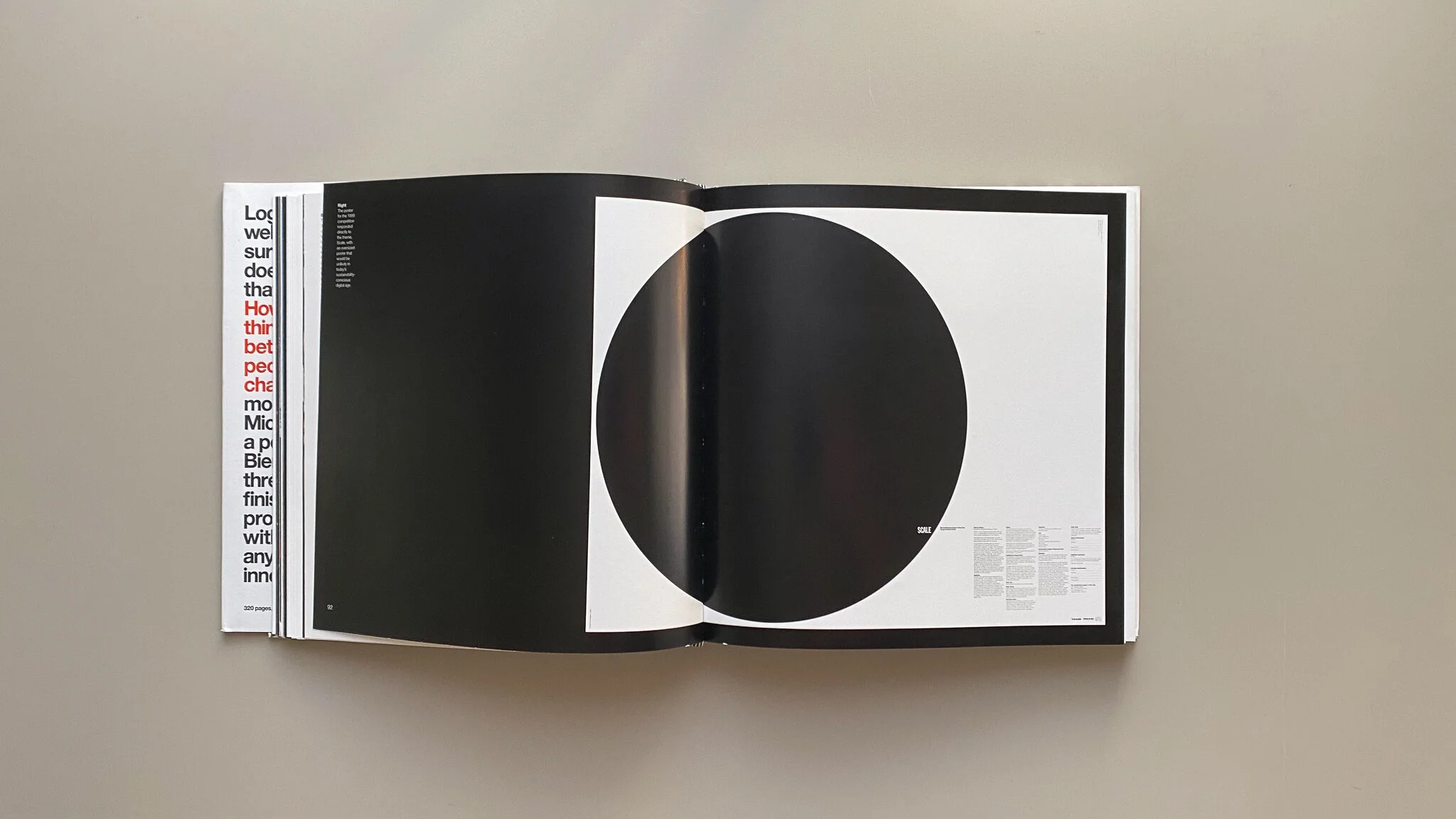
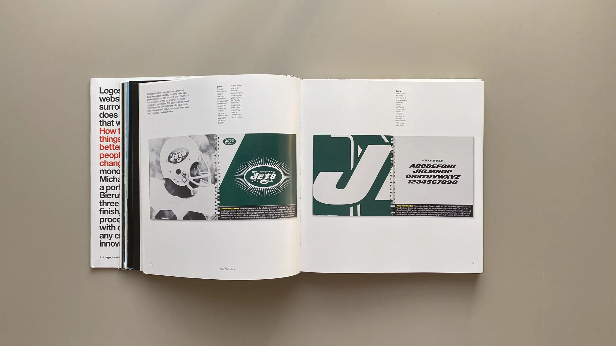
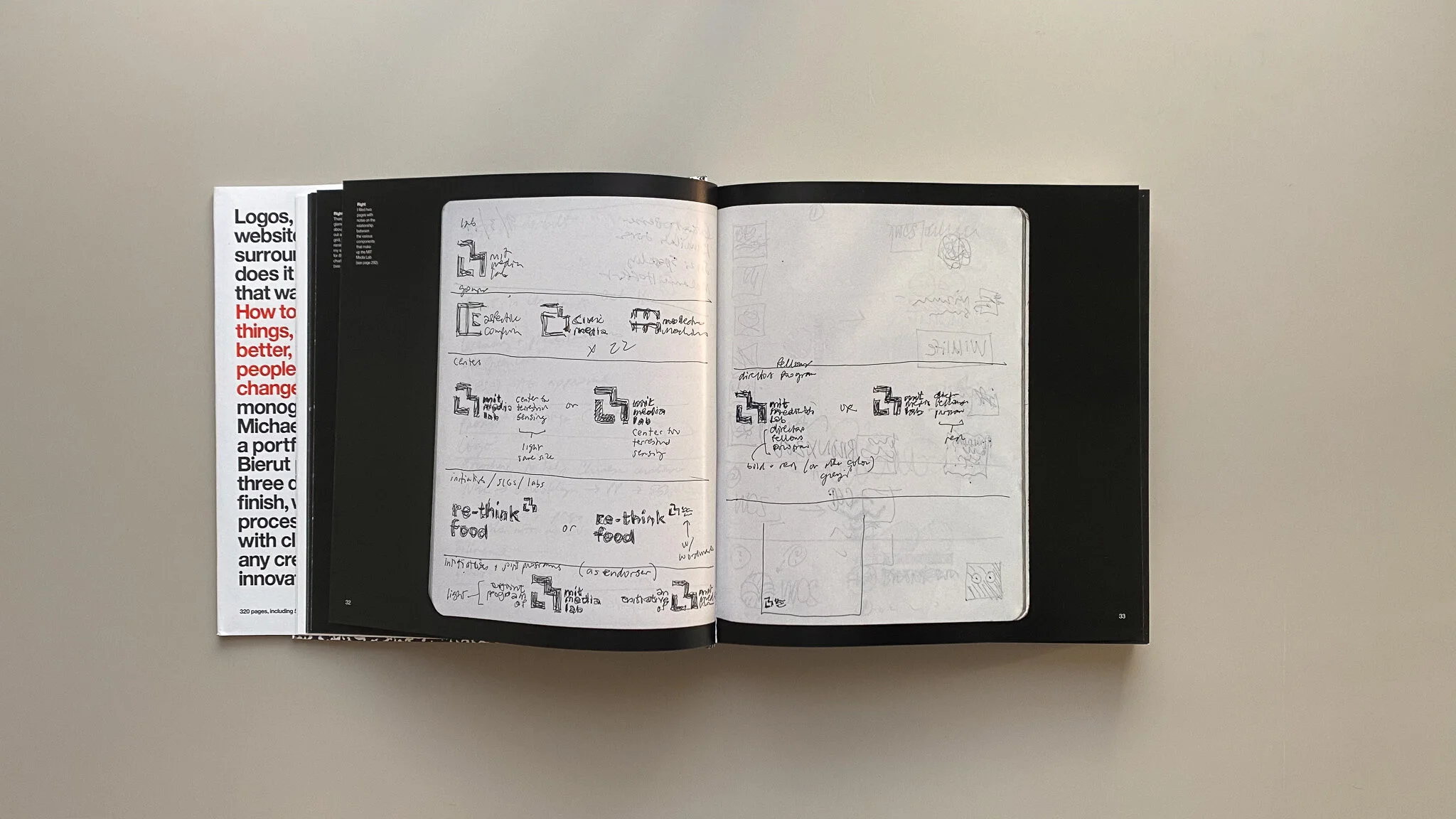
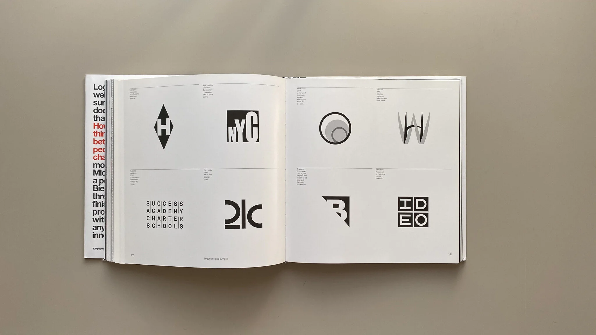
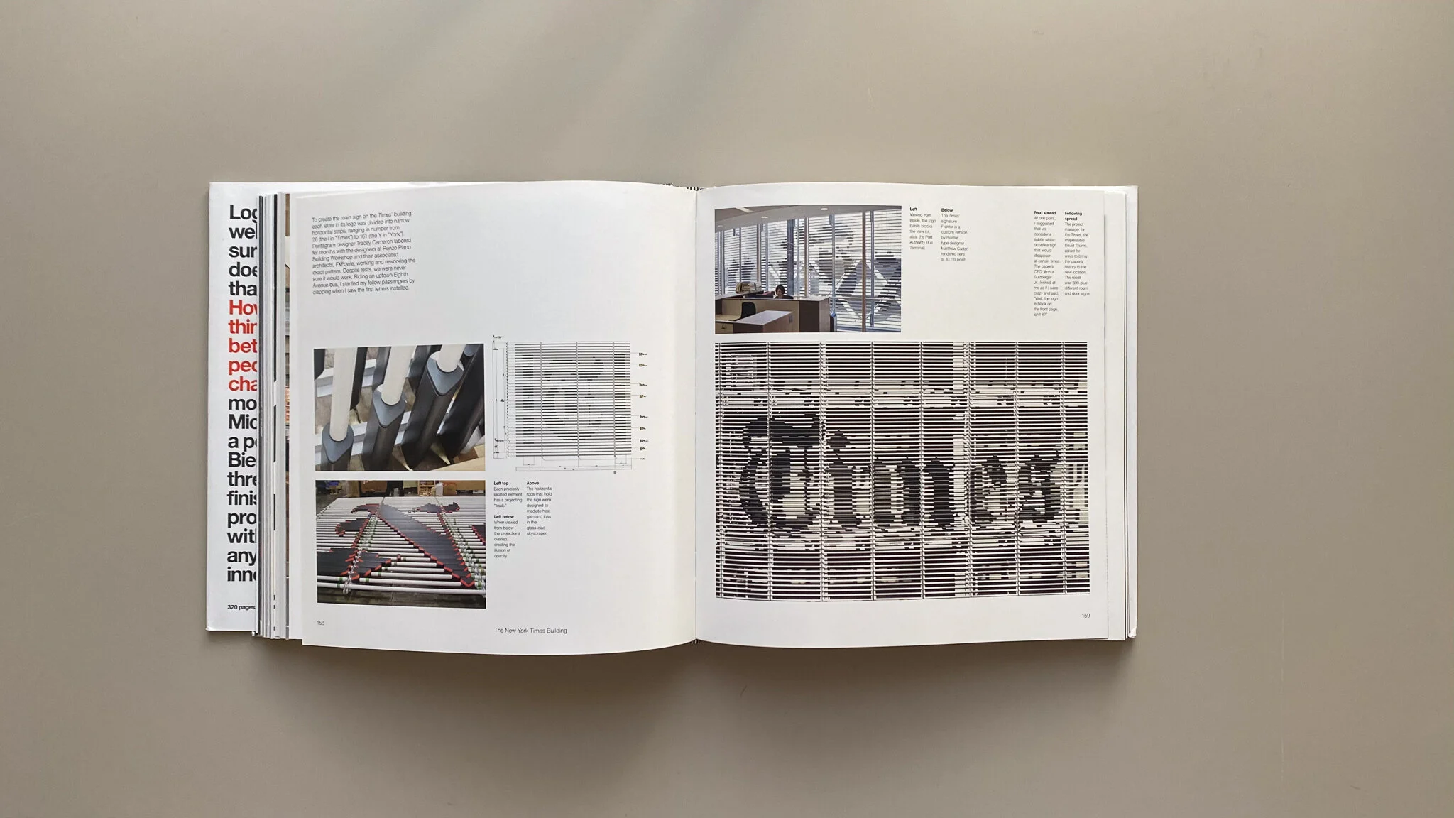
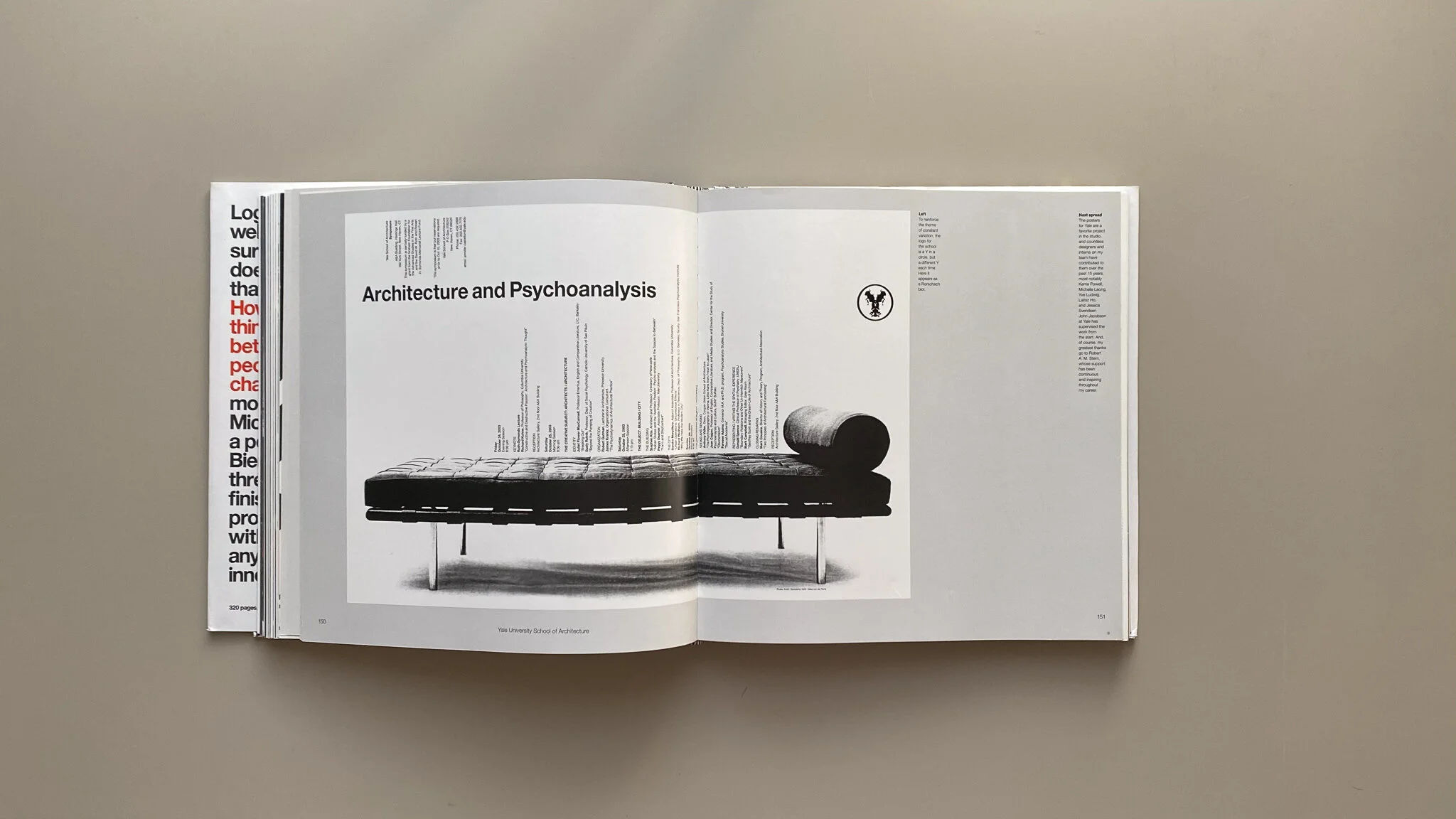
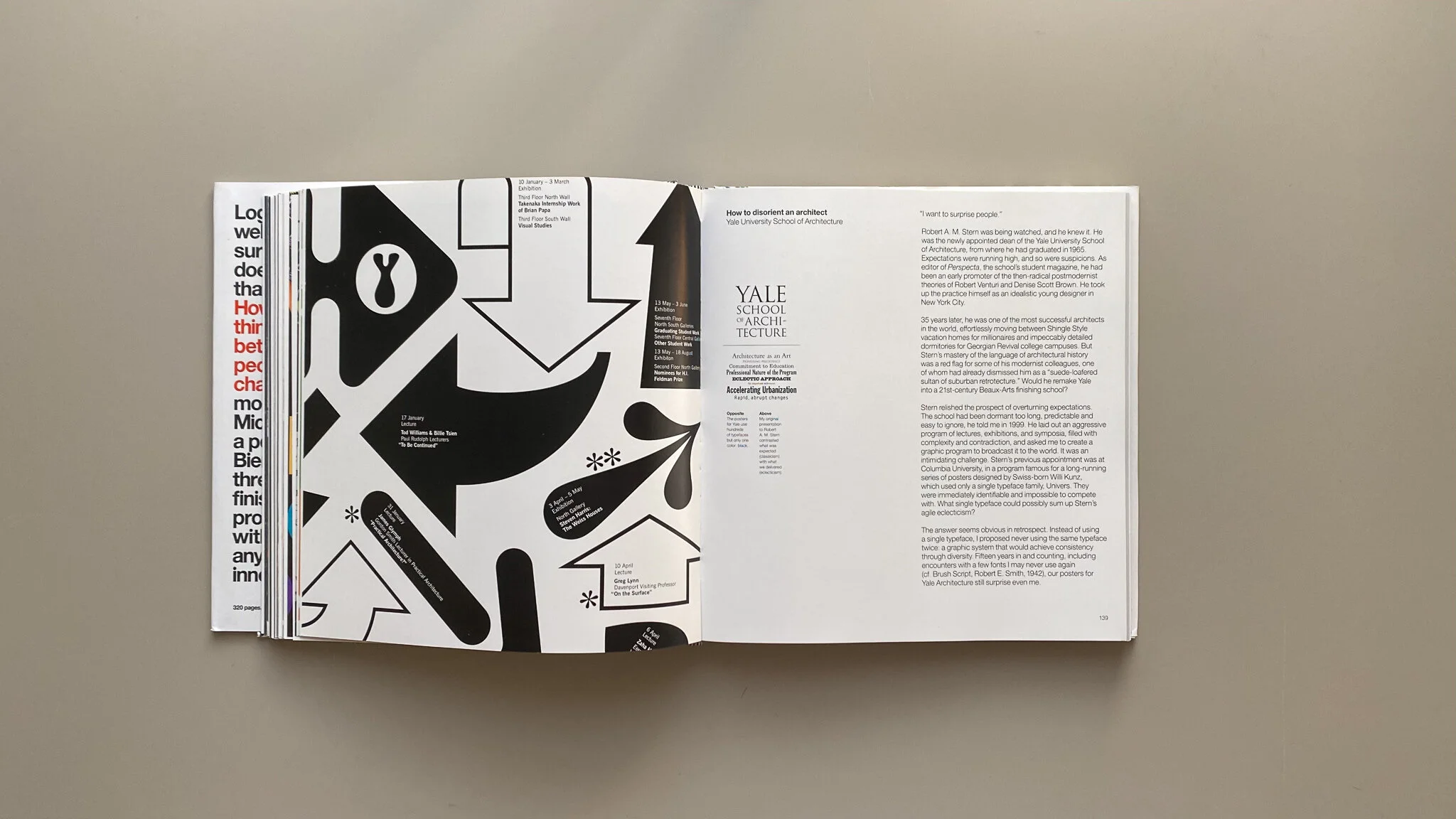
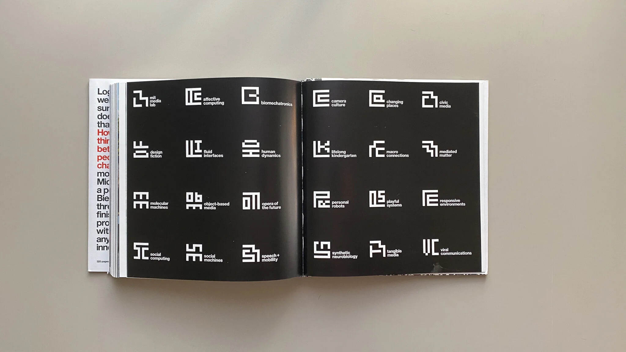
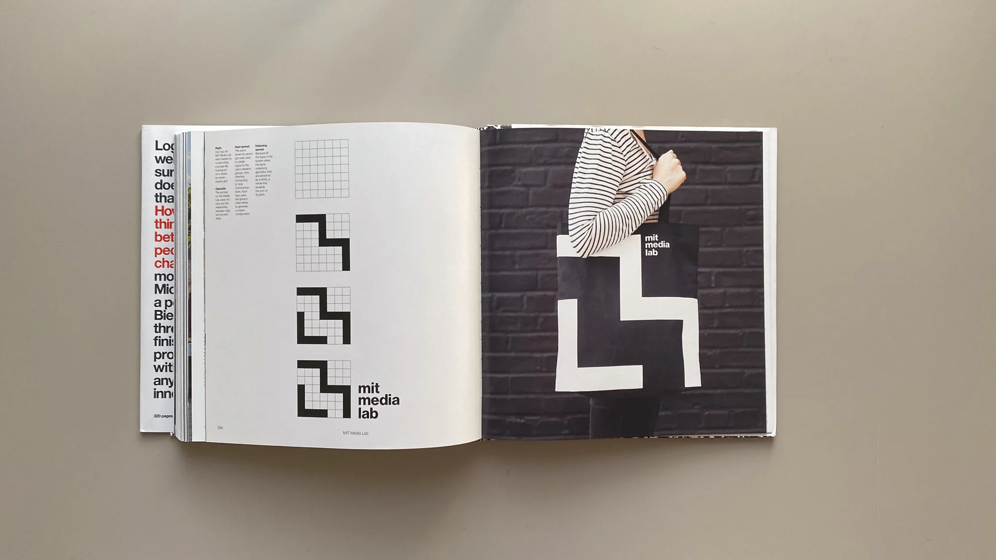
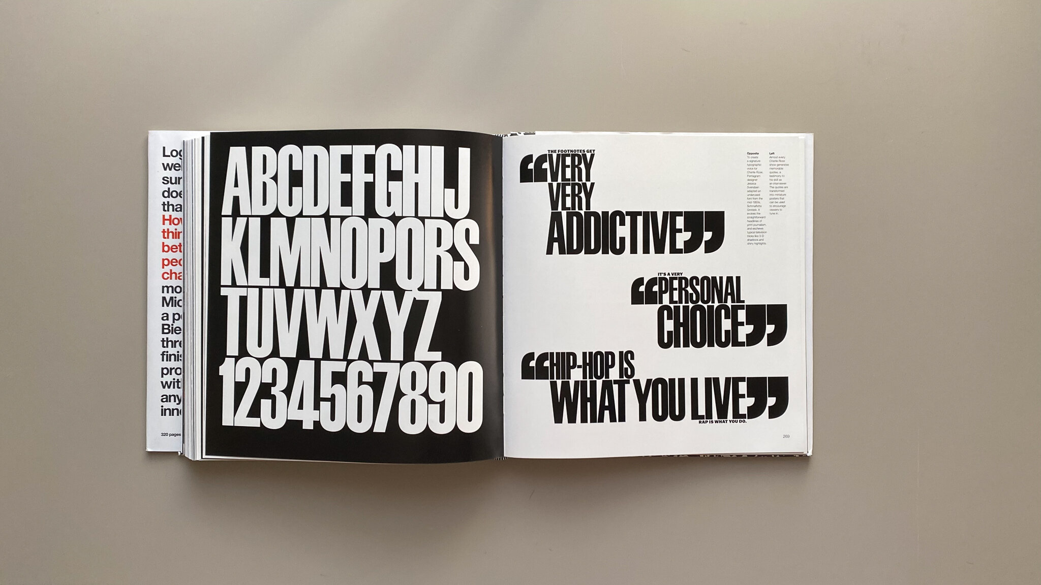
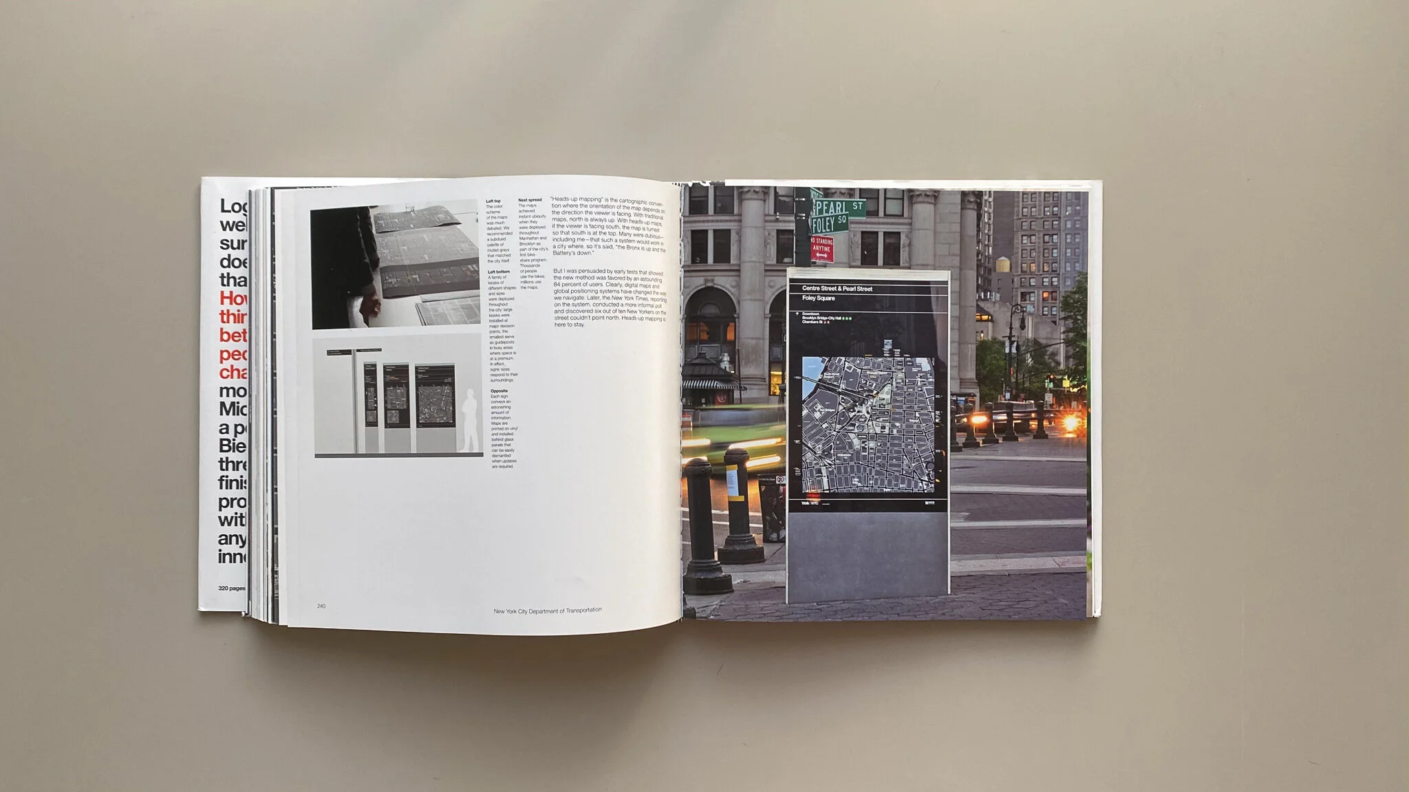
How To is filled with nearly 300 pages of preliminary sketches, works in progress, rejected ideas, and finished work. Each page is filled with diverse personal and client-based work ranging in a multitude of industries in both the nonprofit and for-profit sectors. The work ranges from brand identities for institutions like museums, universities, and even a church to restaurants, sports teams, and even Disney. Although Bierut's design style is recognizable the visual solution to each project is unique making each project feel different. Since this body of work covers 35 years of Michael Bierut's career some of the work does feel outdated making it difficult to pull visual inspiration from it, but the process behind it is timeless.
Another fantastic inclusion in this book is the writing. Bierut does not withhold the secrets of his process and ideas behind each project. Although each project begins with a case study he elaborates further in the captions that follow along with every single image of his work. He includes visual examples of work his clients didn’t like and explains why they didn’t like it, visual examples of alternative ideas that he enjoyed, and even visual examples of how he proposed his concepts to his clients.
Side note, although How To is titled as a “how-to” book it is not literally a guide on how to achieve all of this stuff with graphic design. It’s more so how Michael Bierut used graphic design to do these things within the scope of the projects.
Bierut's writing is casual which works perfectly as he discusses his creative process, relationships with clients, and the issues he faces while his ideas aren’t successful. This is one of the best parts of the book. Most design monographs only discuss the successes of the work and rarely the failures. Michael Bierut is candid as is honest about his ideas that didn’t work and why his clients disagreed with them. Even better, he continues to discuss how he grew from these failures and transformed the idea into something better than both he and his clients ended up enjoying.
There is no doubt that every visual designer should own this title. Although it is a little pricey it is a classic that will remain relevant until the end of time.


