Grid Systems
TITLE AVAILABLE AT
Barnes & Noble
Book Depository
TITLE INFORMATION
Author: Kimberly Elam
Publisher: Princeton Architectural Press
Year Published: 2004
Dimensions: 7in x 8.5in
Pages: 112
Grid Systems by Kimberly Elam is an overview and step-by-step guide on organizing typography within a gridded composition. This book contains over 100 visuals ranging between diagrams and design samples that epitomize the vast amount of layouts working with a simple grid can produce. Elam delves into all of the possible combinations one can create with a simple 3x3 grid in order to help design novices understand the importance and variability of the grid.

This book is formatted directly and objectively. Elam structured this book primarily for the graphic design novice who has little to no experience working with a grid. She has designed it to serve as a workbook as she guides pupils through the various layouts that include: horizontal, vertical and horizontal, and diagonal. She implements these layouts solely on a 3 column x 3 row grid. She implements a system where students and herself are given a few design elements that must be included in each composition. No elements can be added and no elements can be excluded. She has broken down all of the typographic elements into several categories based on various sizes; all of which that need to be included in each layout.

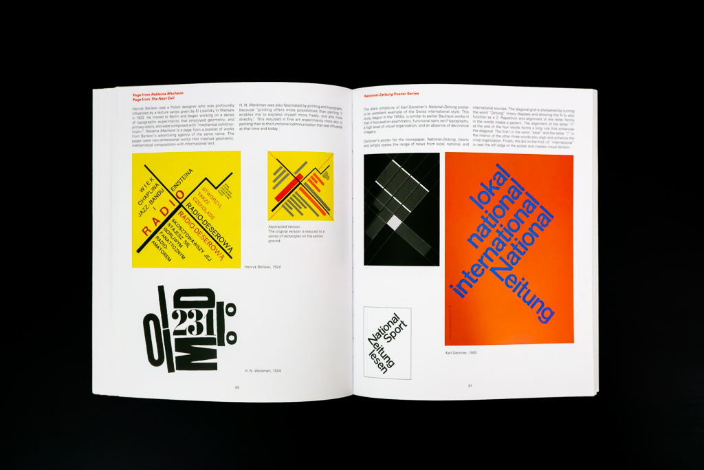
She starts off with explaining and experimenting with compositions by only varying placement horizontally. The elements cannot be placed anywhere on the grid but they cannot be rotated. She works through proportion, negative and positive spaces, movement of the eye, and tension. After this, she picks a few of the layouts she created and identifies some of their flaws [such as too much tension, not enough negative space, etc.] and then fixes them. This is a great technique because it not only points out examples of good design, but it also highlights various reasonings that lead to bad design. Elam then follows up the section with examples of work from the Bauhaus and the modernist movement that utilize horizontal grids. Almost every example includes a transparency with the grid of each composition that lays on top of each piece to show readers the underlying grid being used.

The next section focuses on laying out vertical and horizontal type on the grid. She follows up this section with more real world examples, and then she carries on to discussing diagonal type. This section was interesting to me because I never thought about laying type out diagonally. I knew that it exists in work but I never understood the contextual principles or the math behind it. After reading Elam’s knowledge on the matter, it became extremely clear. She explains the math perfectly and explains why some designers created work based on this model. After this section, Elam then offers several more exercises for pupils to try out. These exercises include using different typographic elements such as dates and paragraphs, as well as using various grids that exceed the 3x3 limit.

I think the content of this book is very fitting for the topic. Elam writes succinctly about the grid, as there is no reason to write a long-winded book about this subject. The subject is better expressed via visuals. Which this book includes plenty of; almost too many at some points. It is hard to try to visualize the amount of type layout combinations that are viable through a modular grid, but Elam ensures to emphasize that point. I enjoy that Elam briefly discusses the challenges and the benefits of each type of grid layout, as well as following by up portraying those strengths with the visuals. Although this book is short, it is not really meant to be read through as a whole. It is better as a teaching tool where each section is digested and applied as on exercise at a time, or as a resource to rely on when one needs a refresher on how experimental a composition can be through using a grid. That being said, Elam provides an incredible amount of analysis that any designer can learn something from. She breaks down each grid to its core and explains how each one can be used to its fullest potential. This is something that I have not seen in any other graphic design book about layout, editorial, or primer.

Although Elam discusses Rule of Thirds and balancing positive and negative space, she doesn’t discuss how she implements geometry or the mathematics of her layouts. Despite discussing certain angles with the diagonal grid layouts as well as nonrepresentational geometry, I still think she could discuss dimensional aspects a little better. She breaks different sizes down by classifying the elements as large, medium, and small which correlate to three columns width, two columns width, and one column width. This is nice for the examples she includes but is not representative of work that exceeds the 3x3 grid composition. That being said, this book primarily focuses on only a 3x3 grid, which is useful to beginners, but is not representative of the types of grids used in for most work. They’re not even close in similarity to the examples of work she shows in this book, which utilize intense grids.

The design of this book is fairly simple since its goal is to focus primarily on the topic and less so the aesthetics. That being said, this book implements a utilitarian mixture of modular two and three column grids, with sans-serif, justified type. To keep with the theme, the folio, table of contents, and all other typographic elements are minimally set.

To be honest, although the design is appropriate for the subject and is contextually appropriate it is still fairly boring. It makes reading the little amount of text mundane, and with the Elam’s writing style, the reader will fall asleep [I may have dozed off once or twice]. Despite the lackluster design, this book makes up for it by including the transparent overlays that illustrate the structure of the grid of each example. It adds an invaluable interactive element to the book that does an amazing job at breaking down the grids of each example. They are extremely beneficial because they help the reader visualize the complexity that goes into organizing diverse information and elements in order to make it appear simple. Not only that, but it is such an interesting element play around with and experience. It is an enjoyable part of the book that serves as a nice contrast from the rest of the content and design. Not only is this element extremely functional, but it is also a dynamic approach that is usually disregarded and forgotten about in many other design books used to educate designers.

Overall, I think this book is necessary for all graphic designers despite how much experience they have. I think any designer, from the novice to that experienced pro, will learn and gain at least one nugget of valuable information from flipping through this book. I also think that this book should be read through at least once despite it not being designed to do so. In doing so, I think the reader will fully understand what this book is about as well as how useful the grid can be. As a designer who learned graphic design through a more contextual and utilitarian perspective, I greatly appreciate Elam’s explanations and reasoning for the purposes of including a lot of the nonrepresentational elements likes rules and geometry into design. These explanations helped widen my own design horizons that I was not comfortable with before reading this book. I also think her section of the diagonal grid is something that every graphic designer should read, because it clears up so much confusion that can be associated with that type of modular design. Her explanations resolve all questions I’ve ever had on the subject. This book is not only beneficial to novices, but it is also beneficial to teachers who are teaching this subject as this whole book is designed to serve as a lesson. Take a look at this book, and devour each and every word, visual, and piece of advice.