Graphic Artists Guild Handbook Pricing & Ethical Guidelines
Today I finally bit the bullet and purchased the Graphic Artists Guild Handbook Pricing & Ethical Guidelines. I have been accumulating some more freelance graphic design opportunities and decided that there is absolutely no reason that this book should not have a spot in my library. I have been hesitant of purchasing it in the past due to it’s $45 price tag, and considering that I can’t appreciate it from cover to cover I didn’t think it was worth it. Upon some further research [and circumstances] I came to appreciate just how valuable and worthwhile this guide is. It is jam-packed with scenarios, advice, templates, and pricing information for several different types of graphic artists careers and jobs. Although I will never read every single page of information in this book, the information that I will refer to is certainly worth the money.
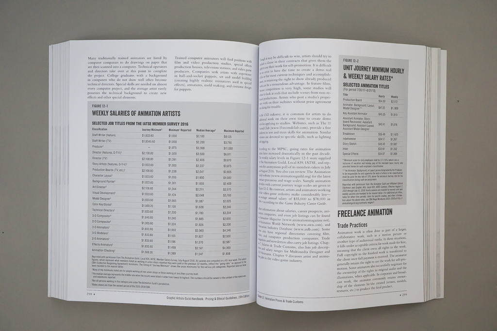
Although this beauty is filled from cover to cover, there is one issue that I have with it; it’s design is lackluster and not contextual. One of my biggest issues is the illustration on the cover doesn’t relate to the content inside. the cover boasts some neon signage propped up on an easel surrounded by fireflies in the middle of a park at night, with a bustling city and mountains in the background. It feels like an illustrator was commissioned to just make whatever they wanted as long as it incorporated the title in some type of display lettering. These light-hearted illustrations carry on through the rest of the guide with faux, grungy paper textures and two-dimensional stars. Looking back at the previous editions, they all incorporate some type of playful illustration that indirectly correlates to the text within it. Although I enjoy the playfulness that is associated with the illustrations, they feel like a Trojan horse, distracting us that the content inside is severely less fun. Or maybe, it’s to distract from the lackluster typography and layout. Minimal type hierarchy, a mundane table of contents, boring folios, and a two-column grid throughout leaves the eyes bored and makes the reading experience dreadful. I understand that I am paying $45 mostly for the information, but the design should still be special considering each edition is published years apart from the previous one. There is also nothing wrong with focusing on a utilitarian design. This book is primarily only referred to when it needs to be used, but that does not mean that it can’t be tastefully utilitarian.
That being said, if you find yourself starting your freelance career, or you are a seasoned designer finding yourself landing more jobs outside of your typical scope, then know that this book is a necessity. Regardless of the bland design, you will probably be more focused on all of what the content offers instead of what the design doesn’t. You can pick this book up at your local big box bookstore, like Barnes & Noble.


